Going from Data to Map
Installed TileMill on your computer.
Reviewed Crash Course
You have a lot of options for making a data-driven map, based on you want to convey, what data is available, and what kind of data it is. The popular symbolization styles like choropleth maps, point density, and scaled points all have advantages and disadvantages, and certain uses that are more natural than others. Here’s a quick guide for where to go.
Let’s start with the kind of data that you have:
Non-Geographic Data
Non-geographic data is data that doesn’t have explicit geographic information. It might have implicit geographical information, like addresses or country names, but it doesn’t have the coordinates of addresses or the borders of countries.
You’ll need to preprocess this data for it to be usable by TileMill or any other geospatial software. Usually this data starts out in a spreadsheet, so that’s where we’ll start. For turning addresses into useful data, you can use geo-googledocs to run a geocoder over each address, finding its latitude and longitude. Our documentation on processing data with Google Docs covers this task.
Points
Geographic points are like euclidean points - they have no area. Points at addresses are simply a single position at that address.
There are several ways to display points, and these depend on what they represent and what you want to present:
Density
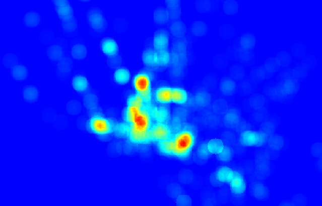
Heat maps are popular ways to show how dense or popular areas are. You can design heat maps in QGIS and use them in TileMill.
Heat maps are most appropriate for data that affects a certain radius and has falloff: for instance, light pollution, radio waves, or incidences of crime. Some heat maps are weighted - certain values make the map more colorful or darker than others - but typically they represent density.
Binning is another option for representing point density. It can end with a cleaner look than heatmaps, and you can adjust the size of the bins to match something like the area you think is affected - like a neighborhood or block size.
Absolute value
Absolute value means a value that comes from zero and represents something that happened ‘at’ a point. For instance, a map of political donations by individual donors with relative circle size by dollar amounts shows absolute value.

Points with absolute values are typically represented as scaled points, as they are in the crashcourse, which uses the example of the richter scale (which is logarithmic for sticklers). However, they can also be represented by points of different colors, or by another symbol.
Polygons
Relative value
The classic symbolization for polygons is the choropleth map, which represents relative values with color differences. For instance, an appropriate choropleth map would show population density or percentage support for a political candidate. Population density is per-square-mile and political support is per-average-citizen: using a choropleth map to show total population would be inappropriate, because larger countries would be over-emphasized and the map becomes a simple proxy for showing country size via population.
Absolute value
Polygons representing absolute value are often turned into points - whether by centroid or simple center - and then represented as scaled points.