Designing heat maps
This is a 10 minute walk through showing how to generate heat maps in QGIS and then display them in TileMill.
Working with QGIS
Make sure you are running at least QGIS >= 1.9. At the time of writing, this is the development release. Mac users can find it at kyngchaos.
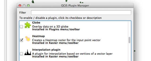
Next you’ll need to enable the Heatmap Plugin. Open the pane below by selecting Plugins > Manage plugins. In the following pane, check the box for the Heatmap Plugin. Note: This plugin is only available for QGIS 1.9 and above. You may need to restart QGIS for these changes to take effect.
Now add some point data. Data below is from the Washington, DC Alcoholic Beverage Regulation Administration, made available by DC’s open data portal data.dc.gov. It can be downloaded here.

Now go to Raster > Heatmap > Heatmap. You should see a dialog box like this:
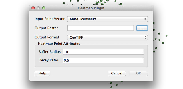
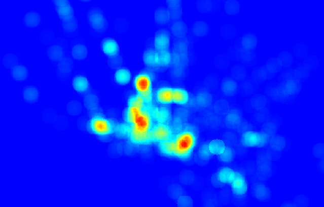
Specify an output filepath (with a .tif extension) and leave the default settings for now. Hit OK to generate your heat map. A big gray rectangle will be added to the project as a new layer. To see the different color values, open the properties pane for your new layer. To get a quick and dirty visualization of the different values we’ll use one of the QGIS preset color schemes. Under the Style tab, set the Colormap drop down menu to ‘Pseudocolor’ and hit ok. You should see a map like this:
Now that you have your map, play around with the colors and other parameters. Defaults are easy, but rarely expose data well. The Heatmap dailog has a great help section that painlessly explains what a ‘spatial buffer’ and ‘decay ratio’ are. See an earlier post on working with raster data to come up with your own custom color scheme. If you want to render your map to tiles with TileMill, the GeoTIFF default is one you don’t have to change.
To render in TileMill, open a new project and load your .tiff as a new layer. Get rid of the #countries layer, and change the map background so that your carto looks like this:
#heatmap {
  raster-opacity:1;
  raster-scaling: bilinear;
  }
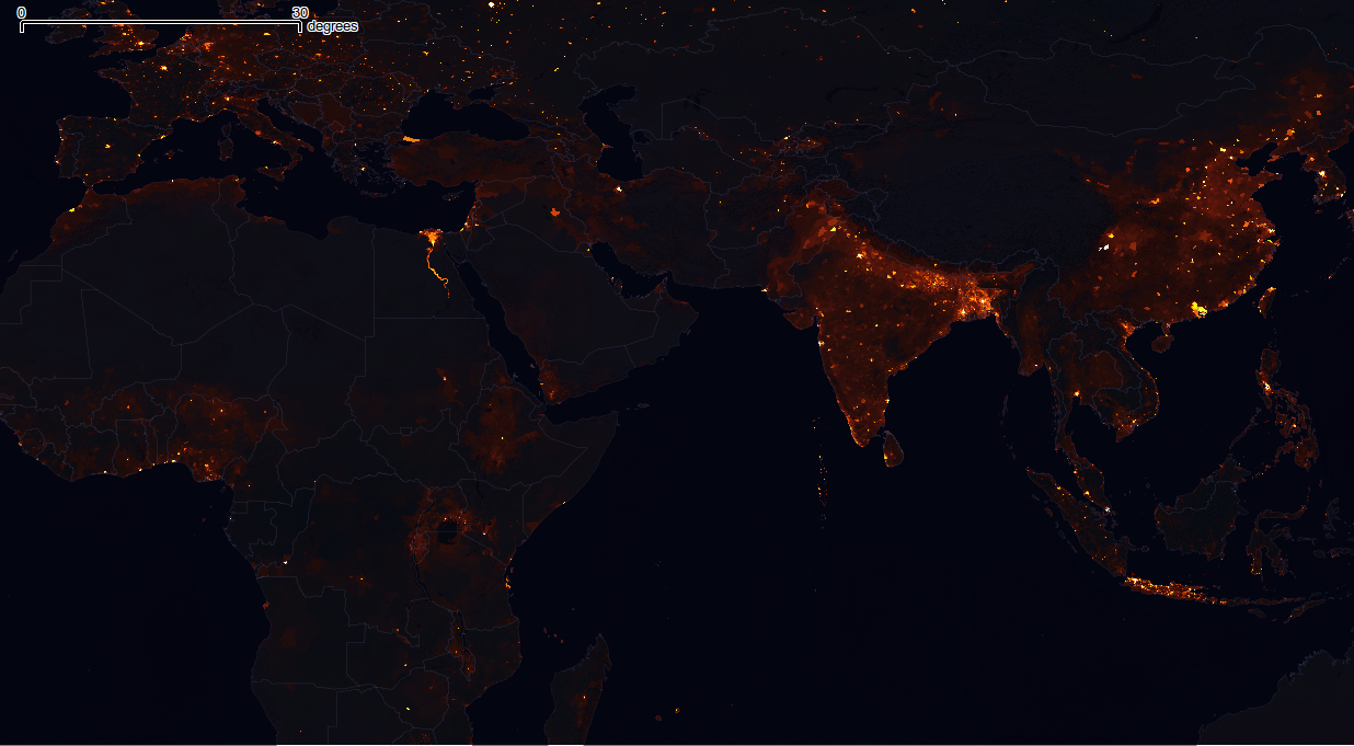
Your map should appear. Just hit upload in the export menu to start sharing your map online. For more info on working with raster data, read docs on reprojecting GeoTIFFs and working with terrain data. If you want more inspiration, check out some of previous work like AJ’s map of the world population.
Faking it with TileMill
TileMill won’t generate rasterized heatmaps like the QGIS plugin can, but you can approximate the effect with a few CartoCSS tricks to take advantage of aggregated opacity: low opacity of individual points means that overlap in dense areas has a stronger, more saturated color value.
This example uses the original shapefile with just a few lines of CartoCSS:
#abralicenseept [DESCRIPTIO != 'Retailer B']{
  marker-width:4;
  marker-fill:#ef0;
  marker-opacity:.45;
  marker-line-opacity:0;
  marker-allow-overlap:true;
} _Note: This code also omits any locations listed as 'Retailer B' to get rid of grocery stores to better show where bars and nightlife are in DC._
This approach has the added benefit of retaining the exact locations of individual dots at higher zoom levels, as well as the possibility of feature-specific interactivity. For further styling tips, learn more about advanced map design.